


Nuke It Website
Nuke It is an in-development website for making recommendations on how long to microwave various foods, using crowd-sourced data. I designed the layout for the site, seen here.
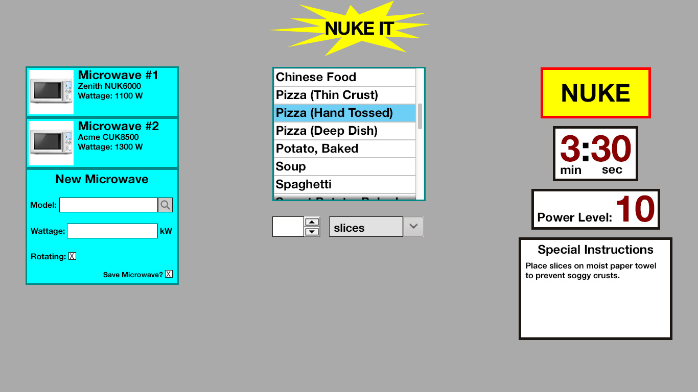
Nuke It homepage
The page’s preferred layout requires no scrolling, but it of course utilizes a dynamic layout where the three columns may flow vertically instead of horizontally, especially for mobile broswers. It is designed to store persistent data on the user’s machine to keep track of users’ microwave oven(s), but it easily allows the user to temporary add an addition oven on the fly. A lightweight login process may be added to store not only the ovens, but also their most requested foods. The page should need only load initially.
The user selects a microwave, or creates a temporary profile with the microwaves wattage, and then chooses from a long list of foods. Below, they will indicate the quantity of food. The units (pieces, slices, ounces, etc.) native to each food will auto-populate, and in cases where multiple possible units exist, the unit box will transform into a dropdown box. After the “NUKE” button is pressed, the fields in the third column will populate with recommended cooking time and power level, plus any additional instructions. These values will be calculated server-side.
I also designed the layout for the mobile version of the application, which can be seen on the mobile page.
Bella Vista Recycling Center
Bella Vista Recycling Center is a non-profit recyclable material collection and processing center run by a local chapter of the AARP. As part of a class project, I redesigned their website.
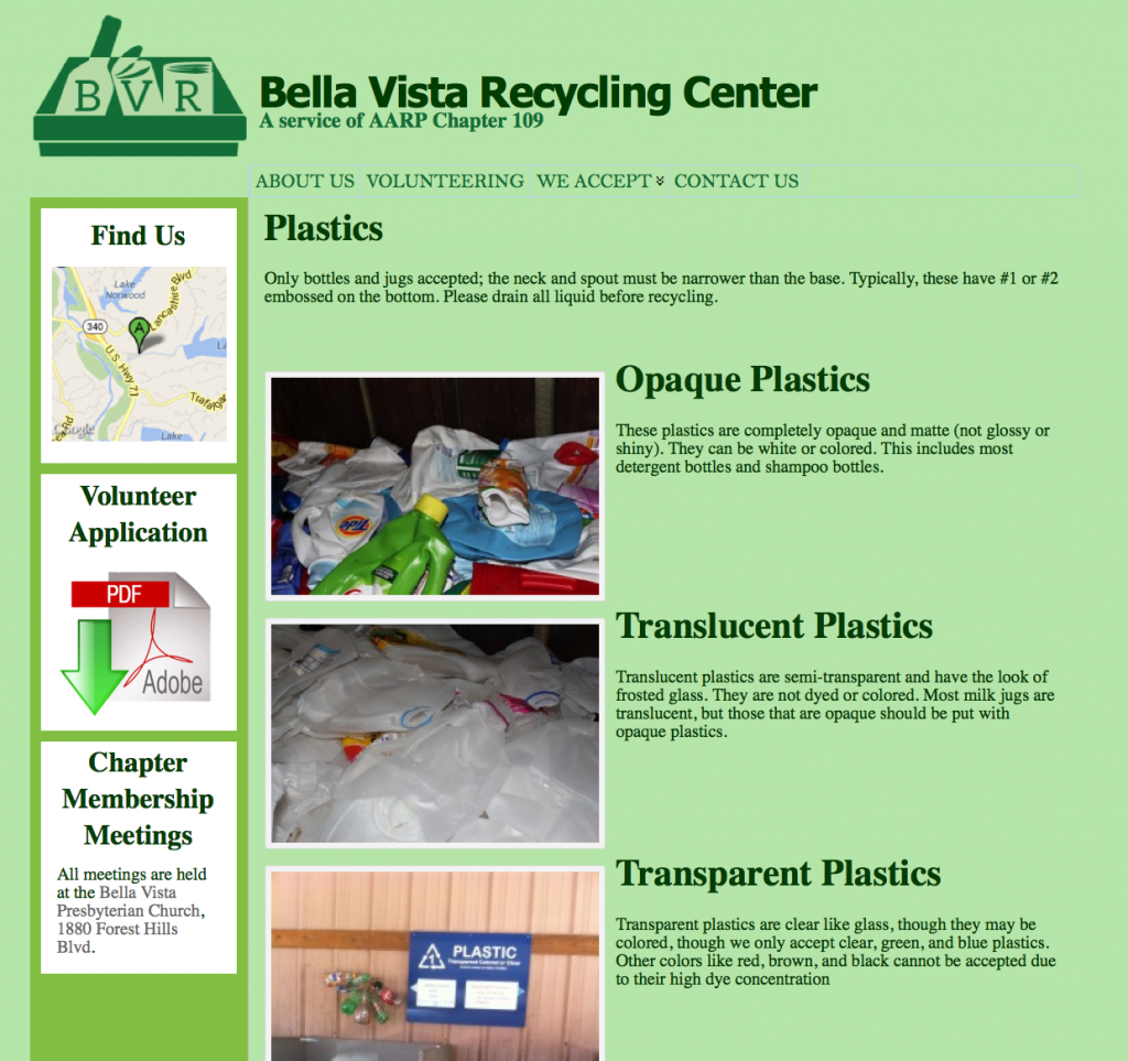
You can see the site’s former design below. I used the popular and versatile Atahualpa theme with WordPress to redesign the site and implement a number of changes. There is a left sidebar. Instead of a “Find Us” page with a static map image, the top sidebar item is a Google Maps widget.
The Volunteer Application, previously hidden on the “Volunteer” page, is now always accessible in the sidebar. It’s also conveniently linked from the “Volunteering” page.
Finally, the Chapter Meetings page is reimagined as a bulletin on the sidebar, where more important notices can be added as needed.